full screen background image
  
Search
Thursday 14 November 2024
  • :
  • :

CETL Reflections, Tips, and Quotes

CETL Tips of the Week – COFFEES

Contributed by Dr. Christophe Coupé, Faculty of Arts, HKU
Link to the page
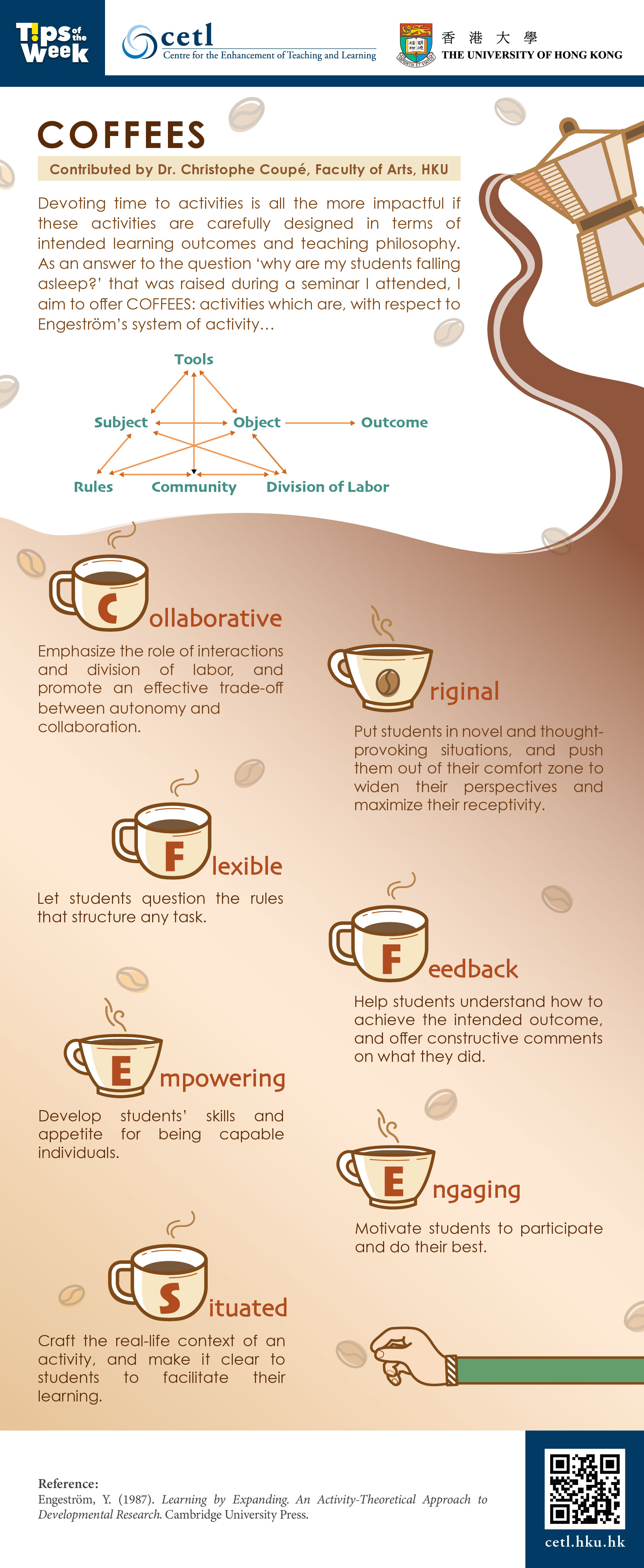
Devoting time to activities is all the more impactful if these activities are carefully designed in terms of intended learning outcomes and teaching philosophy. As an answer to the question ‘why are my students falling asleep?’ that was raised during a seminar I attended, I aim to offer COFFEES: activities which are, with respect to Engeström’s system of activity…
  1. Collaborative
    Emphasize the role of interactions and division of labor, and promote an effective trade-off between autonomy and collaboration.
  2. Original
    Put students in novel and thought- provoking situations, and push them out of their comfort zone to widen their perspectives and maximize their receptivity.
  3. Flexible
    Let students question the rules that structure any task.
  4. Feedback
    Help students understand how to achieve the intended outcome, and offer constructive comments on what they did.
  5. Empowering
    Develop students’ skills and appetite for being capable individuals.
  6. Engaging
    Motivate students to participate and do their best.
  7. Situated
    Craft the real-life context of an activity, and make it clear to students to facilitate their learning.
References:
  • Engeström, Y. (1987). Learning by Expanding. An Activity-Theoretical Approach to Developmental Research. Cambridge University Press.

Posting date:  9-Dec-2022

Nov 2022

CETL Quote of the Week – Dr. Law Ka Ho

Link to the page
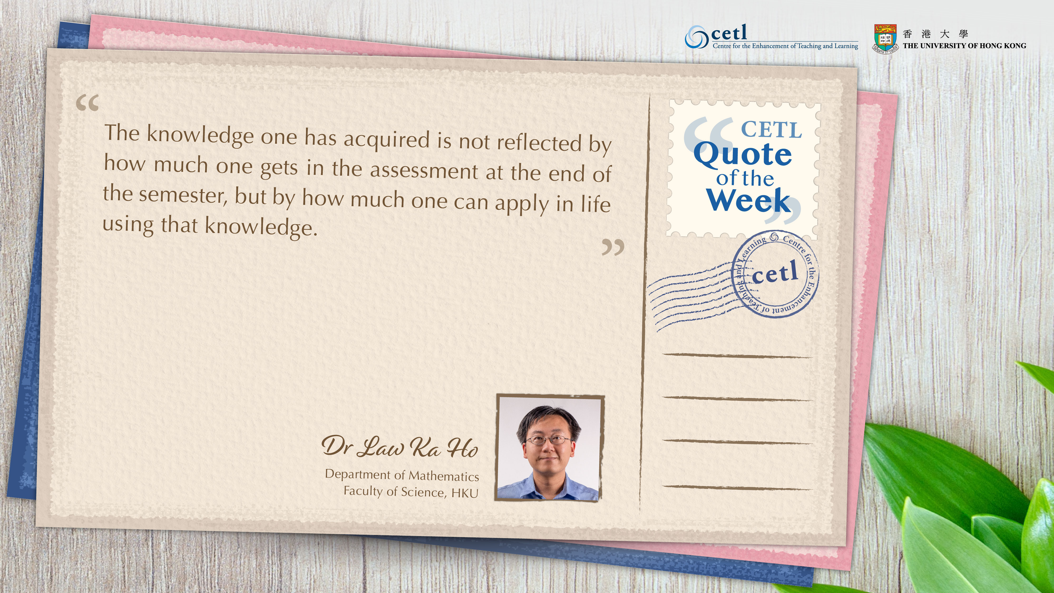
"The knowledge one has acquired is not reflected by how much one gets in the assessment at the end of the semester, but by how much one can apply in life using that knowledge."
 
Dr. Law Ka Ho
Department of Mathematics, Faculty of Science, HKU

Posting date:  30-Nov-2022

CETL Tips of the Week – Visual Design Basics

Link to the page
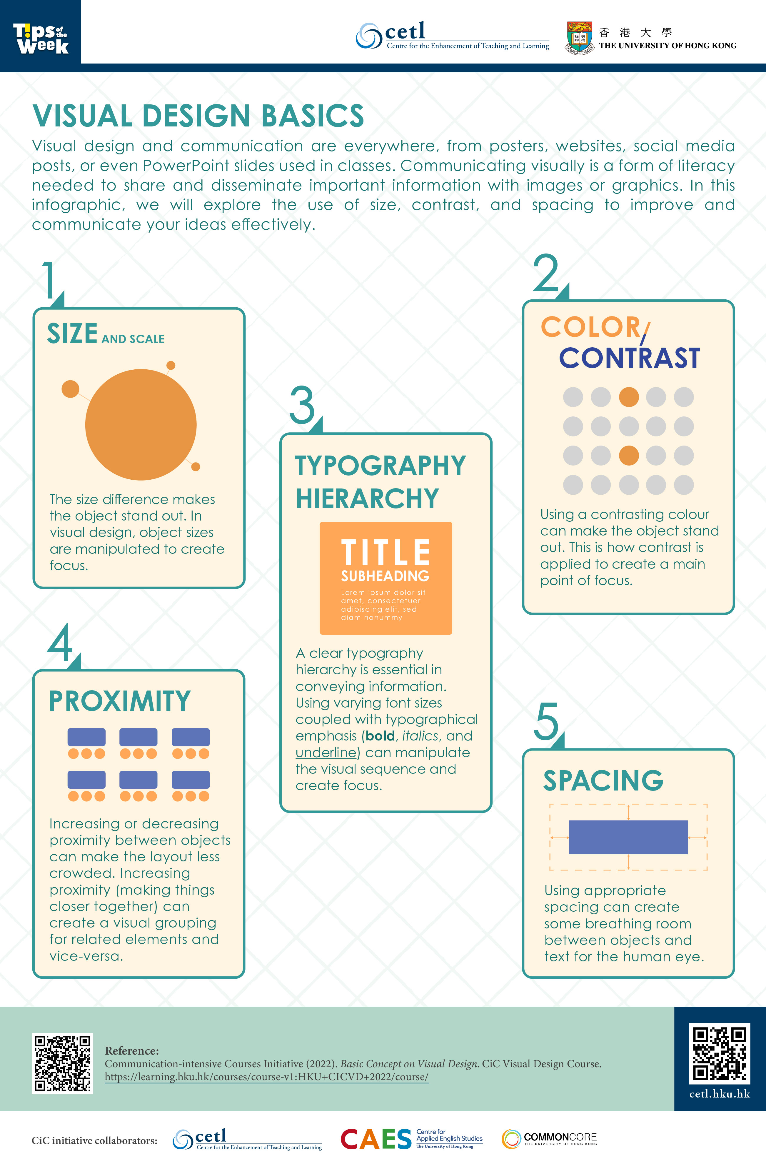
Visual design and communication are everywhere, from posters, websites, social media posts, or even PowerPoint slides used in classes. Communicating visually is a form of literacy needed to share and disseminate important information with images or graphics. In this infographic, we will explore the use of size, contrast, and spacing to improve to communicate your ideas effectively.
  1. Size and Scale
    The size difference makes the object stand out. In visual design, object sizes are manipulated to create focus.
  2. Color / Contrast
    Using a contrasting colour can make the object stand out. This is how contrast is applied to create a main point of focus.
  3. Typography Hierarchy
    A clear typography hierarchy is essential in conveying information. Using varying font sizes coupled with typographical emphasis (bold, italics, and underline) can manipulate the visual sequence and create focus.
  4. Proximity
    Increasing or decreasing proximity between objects can make the layout less crowded. Increasing proximity (making things close together) can create a visual grouping for related elements and vice-versa.
  5. Spacing
    Using appropriate spacing can create a breathing room between objects and text for the human eye.
References:

Posting date:  18-Nov-2022

CETL Quote of the Week – Dr. James Tsoi

Link to the page
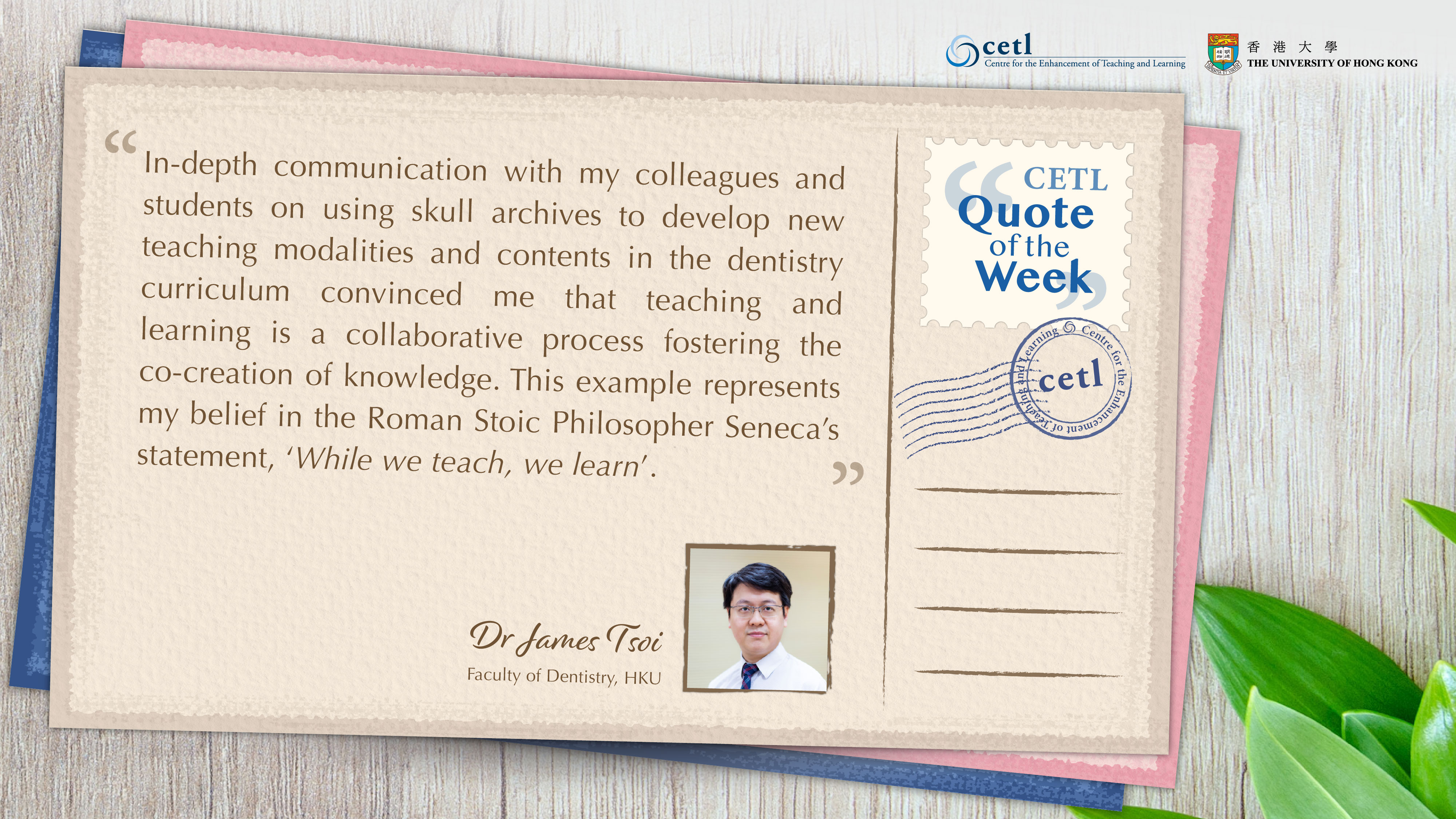
"In-depth communication with my colleagues and students on using skull archives to develop new teaching modalities and contents in the dentistry curriculum convinced me that teaching and learning is a collaborative process fostering the co-creation of knowledge. This example represents my belief in the Roman Stoic Philosopher Seneca's statement, 'While we teach, we learn'."
 
Dr. James Tsoi
Faculty of Dentistry, HKU

Posting date:  10-Nov-2022

Oct 2022

CETL Tips of the Week – Public-facing Assessments

Contributed by Mr. Sony Devabhaktuni, Faculty of Architecture, HKU
Link to the page
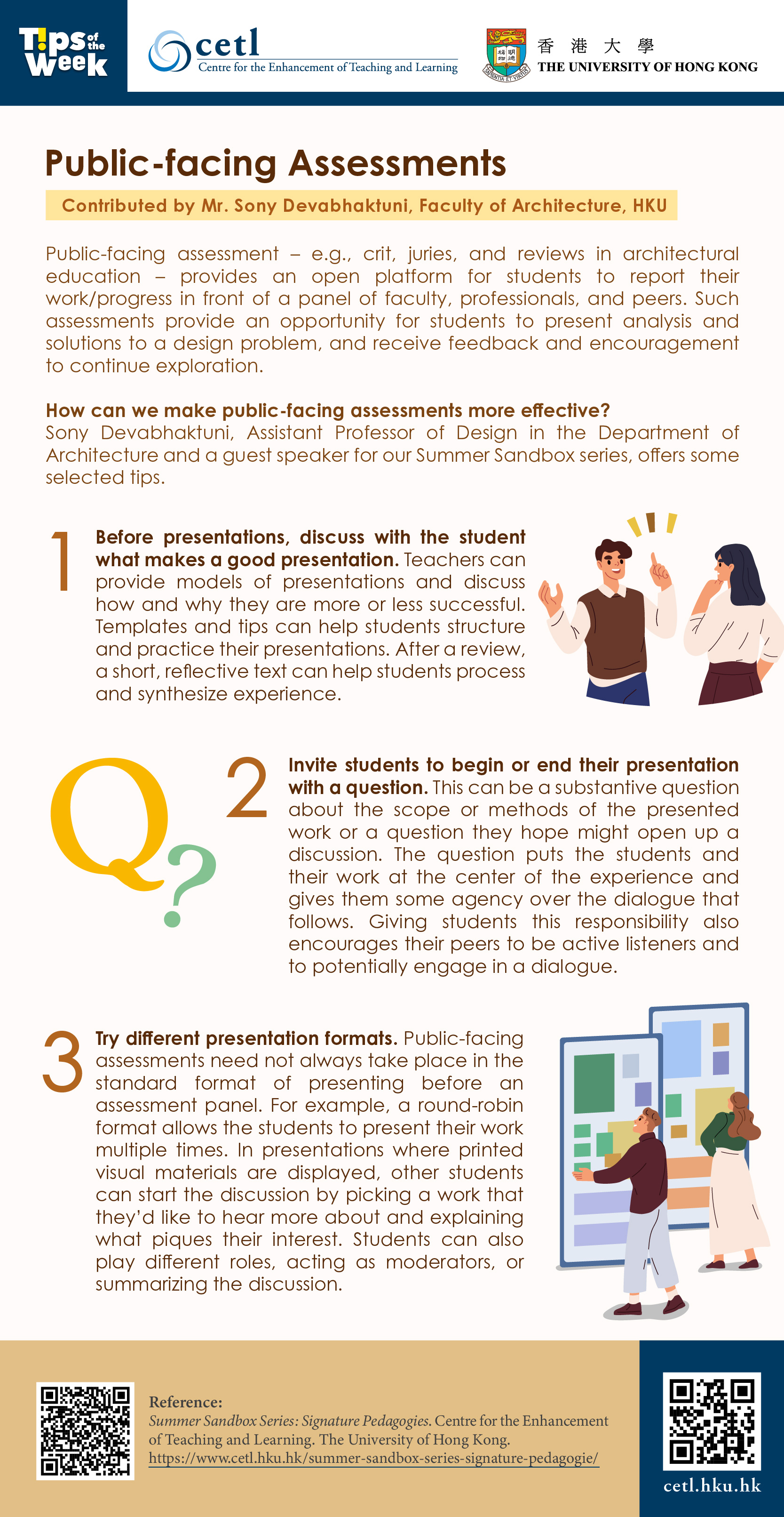
Public-facing assessment – e.g., crit, juries, and reviews in architectural education – provides an open platform for students to report their work/progress in front of a panel of faculty, professionals, and peers. Such assessments provide an opportunity for students to present analysis and solutions to a design problem, and receive feedback and encouragement to continue exploration.

How can we make public-facing assessments more effective? Sony Devabhaktuni, Assistant Professor of Design in the Department of Architecture and a guest speaker for our Summer Sandbox series, offers some selected tips.

  1. Before presentations, discuss with the student what makes a good presentation. Teachers can provide models of presentations and discuss how and why they are more or less successful. Templates and tips can help students structure and practice their presentations. After a review, a short, reflective text can help students process and synthesize experience.
  2. Invite students to begin or end their presentation with a question. This can be a substantive question about the scope or methods of the presented work or a question they hope might open up a discussion. The question puts the students and their work at the center of the experience and gives them some agency over the dialogue that follows. Giving students this responsibility also encourages their peers to be active listeners and to potentially engage in a dialogue.
  3. Try different presentation formats. Public-facing assessments need not always take place in the standard format of presenting before an assessment panel. For example, a round-robin format allows the students to present their work multiple times. In presentations where printed visual materials are displayed, other students can start the discussion by picking a work that they’d like to hear more about and explaining what piques their interest. Students can also play different roles, acting as moderators, or summarizing the discussion.
References:

Posting date:  31-Oct-2022

Oct 2022

CETL Tips of the Week – Critical Elements of Effective Communication

Contributed by Michael Campion, Partner, Quinlan and Associate
Link to the page
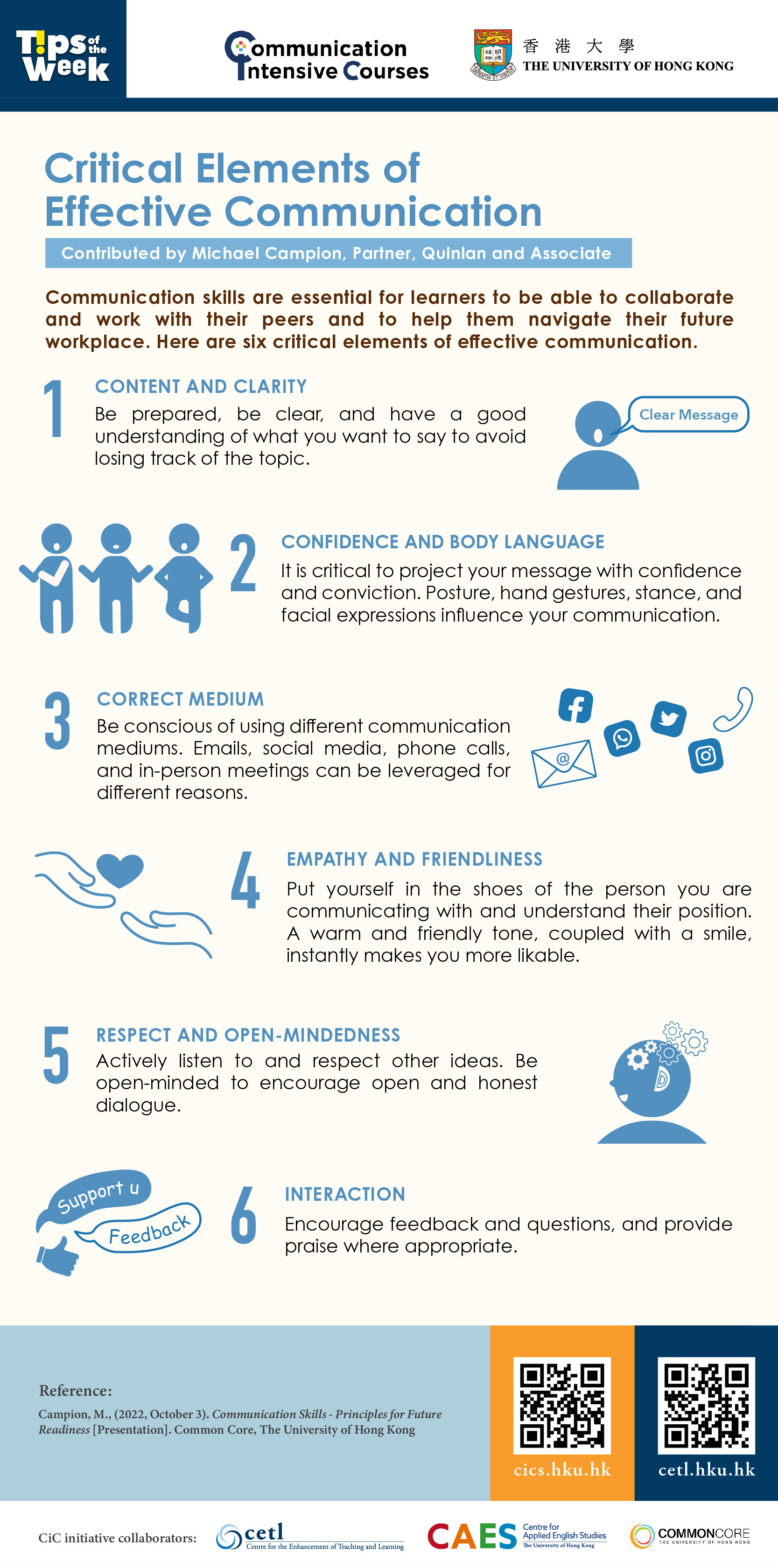
Communication skills are essential for learners to be able to collaborate and work with their peers and to help them navigate their future workplace. Here are six critical elements of effective communication.
  1. Content and Clarity
    Be prepared, be clear, and have a good understanding of what you want to say to avoid losing track of the topic.
  2. Confidence and Body Language
    It is critical to project your message with confidence and conviction. Posture, hand gestures, stance, and facial expressions influence your communication.
  3. Correct Medium
    Be conscious of using different communication mediums. Emails, social media, phone calls, and in-person meetings can be leveraged for different reasons.
  4. Empathy and Friendliness
    Put yourself in the shoes of the person you are communicating with and understand their position. A warm and friendly tone, coupled with a smile, instantly makes you more likable.
  5. Respect and Open-mindedness
    Actively listen to and respect other ideas. Be open-minded to encourage open and honest dialogue.
  6. Interaction
    Encourage feedback and questions, and provide praise where appropriate
References:
  • Campion, M., (2022, October 3). Communication Skills - Principles for Future Readiness [Presentation]. Common Core, The University of Hong Kong

Posting date:  22-Oct-2022